Launching a new Shopify store can be an exhilarating adventure, but it’s also fraught with challenges. Many new store owners unknowingly stumble into common Shopify mistakes that can undermine their success. Today, we’ll explore these pitfalls and provide valuable tips to help you avoid them, ensuring that your eCommerce endeavor is as fruitful as possible.
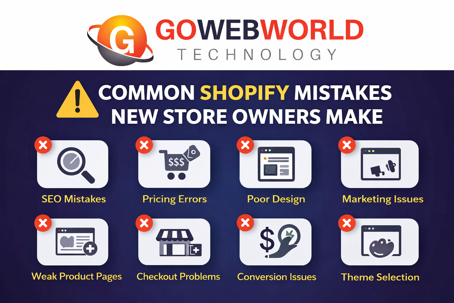
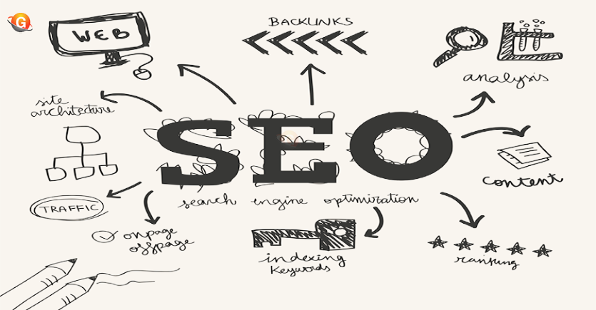
Poor SEO Practices
One of the most significant oversights for new Shopify store owners is neglecting SEO. Your online store needs to be easily discoverable by search engines to attract traffic. Common Shopify mistakes in this area include not optimizing product descriptions, overlooking image alt tags, and failing to incorporate relevant keywords. To boost your visibility, invest time in learning about SEO best practices and apply them diligently during your store setup.
Weak Product Pages
Product pages serve as the heart of your online store, yet many new owners create pages that lack detail or appeal. Shopify beginner mistakes often include using low-quality images, insufficient product information, and generic descriptions. To enhance your product pages, focus on high-quality images, unique descriptions, and user-generated content like reviews. This not only improves customer trust but also enhances SEO.
Incorrect Pricing
Pricing your products incorrectly can lead to lost sales or dwindling profits. New owners often struggle with this aspect, either overpricing out of fear of loss or underpricing to attract customers. It’s essential to conduct market research and consider your costs to determine the right pricing strategy. Offering promotions or bundled deals can also help pique interest without pricing yourself out of the market.
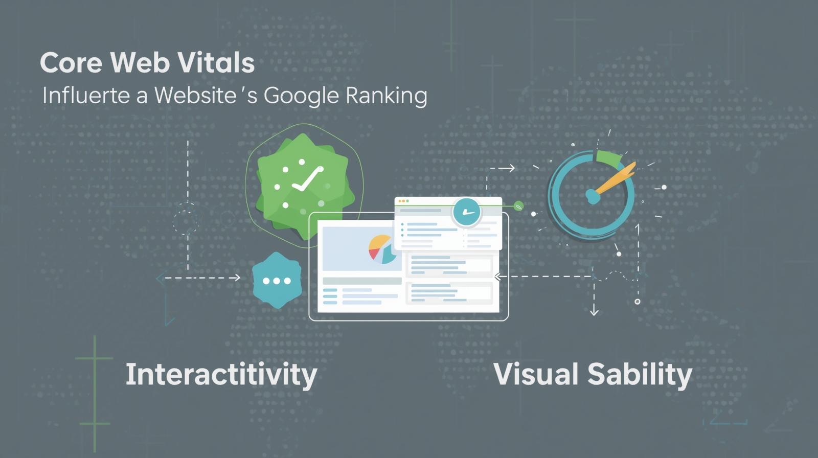
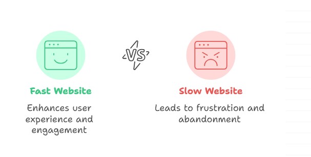
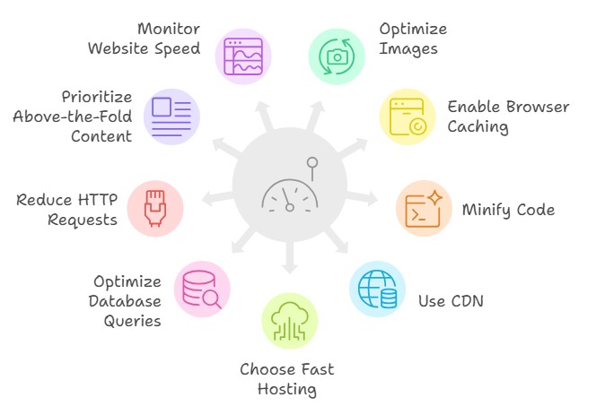
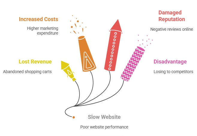
Slow Website Speed
In the fast-paced world of online shopping, every second counts. Slow website speed can frustrate potential customers and lead to high bounce rates. While utilizing sleek themes and apps, monitor your store’s performance regularly. Optimize images, eliminate unnecessary apps, and use Shopify’s built-in features to enhance loading speed. Remember, a swift site can significantly impact your sales growth!
Ignoring Mobile Users
With an increasing percentage of consumers shopping on mobile devices, neglecting mobile optimization is a critical Shopify error. Poor mobile experiences can deter customers and harm your conversion rates. Ensure that your theme is responsive and that your product pages load quickly on mobile devices. Testing the mobile interface regularly can help you identify any issues before they become significant problems.
Lack of Marketing Strategy
A brilliant product without a marketing strategy is like a ship without a sail. Many new store owners dive into the eCommerce landscape without a clear plan for reaching their audience. To avoid common Shopify mistakes associated with marketing, develop a comprehensive strategy that covers social media, email marketing, and paid advertising. Utilize Shopify tips for beginners to craft targeted campaigns that resonate with your audience.
Complicated Checkout Process
A smooth checkout experience is vital for conversion. Complicated checkout processes can lead to cart abandonment, which is a significant problem for online stores. Simplify your checkout process by minimizing the number of steps required to complete a purchase. Consider offering guest checkout options to make the process even easier for new customers.
Wrong Theme Selection
Choosing the wrong theme can drastically impact your store’s usability and aesthetic appeal. New Shopify store setup mistakes include opting for visually appealing themes that may not be functional or responsive. Always select themes that align with your brand and offer the features you need. Preview multiple themes before settling on one, ensuring it enhances the shopping experience rather than detracts from it.
Not Building Customer Trust
Establishing trust with your customers is crucial, especially for new online stores. Consumers may be hesitant to purchase from a brand they are unfamiliar with. Ensure that you include trust signals such as customer reviews, security badges, and clear return policies on your site. Engaging with customers through social media and prompt customer service can also foster trust.
Starting a Shopify store can feel overwhelming, but you can navigate these common Shopify mistakes with the right knowledge and preparation. By focusing on SEO, optimizing your product pages, setting correct pricing, and ensuring smooth experiences for mobile users, you set the stage for success. Moreover, a solid marketing strategy and a user-friendly checkout experience can bolster your growth and help you stand out in the competitive eCommerce market.
As you embark on your Shopify journey, keeping these tips in mind will help you avoid common Shopify problems and pave the way for long-term success. Embrace best practices for new stores, and watch your sales soar!